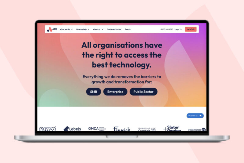
At ANS, we aim to make technology accessible for all organisations, large or small, public or private. That’s why we’ve been working behind the scenes to create a brand-new website. We spoke to our customers and they all said they wanted something simple, stripped back, that made it easy to find the information they need.
So, the new ANS website has been carefully designed for simpler customer journeys, straight forward navigation with a lot less text.
A quick summary of what’s different:
Simpler customer journey
Our UX team and several research groups tested different ways to serve information to SMBs, public sector and enterprises, and came up with a simple drop down navigation. So hopefully it’s easier to find the information you are looking for.
Stripped back design
We’ve taken out a lot of imagery and text, simplified the language in an attempt to make getting what you need quick and easy.
More on who you would work with
With more pages about ANS and our culture, we wanted to give you more insight into our people and how we work with you.
We’ve included more on how we’ve helped customers and a new insight section where our experts share their thoughts on the latest tech, trends and developments.
We hope you like it.


